
TERPENE RIVER
PACKAGING / BRANDING / STYLE GUIDE / WEB DESIGN / 3D RENDERS / ICONS / SAFETY DATA SHEETS / CONTENT CREATION
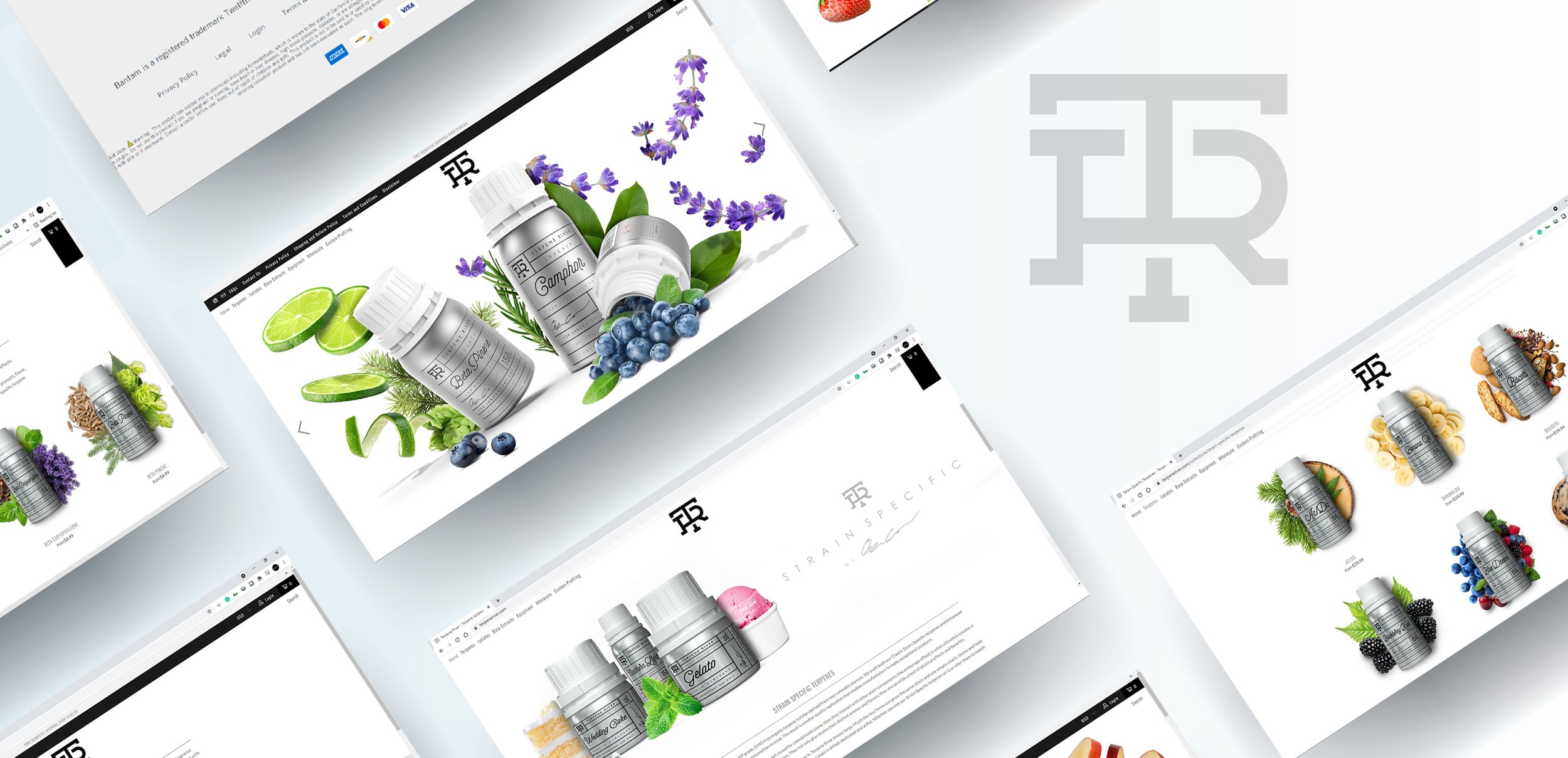
A huge range of flavors and products were completed for Terpene River. Every facet of the brand was created— from the logo and branding, to every product label, social media image, 3D render, fruit mockup and website banner — to make Terpene River what it is.
With more than 50 flavors and strains, each with six different sizes — more than 300 different labels were completed in several iterations. Flavor asset mockups were then created to support and describe every one of those iterations.
The logo and mark were designed with both clarity and contrast in mind. Strength of typography is a key feature in all brand elements, including the logo, mark and packaging. Color is selectively used in only two applications to maintain the clean character of the brand — the first designated use being the color in the flavor assets, and the second, in alternating color blocks within social media posts.
Terpene River’s classic style delivers on the determination for a clean and confident brand.


